

* Estilos personalizados para Navegación post/Page
* Autor: Ariapsa Diseño y Soporte Web
* Sitio: https://ariapsa.com/shop
ESTILOS BOTONES
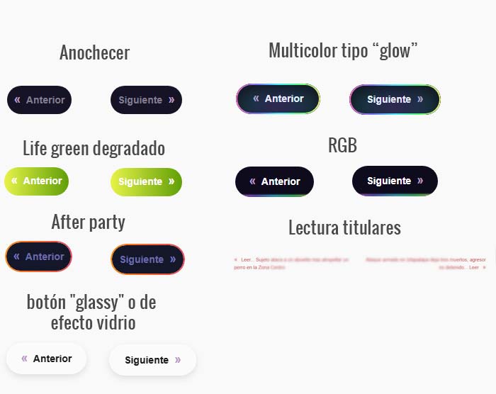
========== Anochecer ===========
COPIA Y PEGA CSS:
Código
/* Estilo ajustado con paleta del sitio y texto centrado */
.nsp-navigation-container a {
font-weight: 600;
font-size: 14px;
color: #807d8e; /* Texto normal */
padding: 6px 10px;
background-color: #161326; /* Fondo normal */
border-radius: 50px;
text-decoration: none;
outline: none;
border: none;
display: inline-flex; /* Usamos flex para centrar */
align-items: center; /* Centrado vertical */
justify-content: center; /* Centrado horizontal */
transition: background-color 0.3s ease, color 0.3s ease;
}
.nsp-navigation-container a:hover {
background-color: #161326; /* Fondo hover */
color: #ffffff; /* Texto hover */
}
/* Color personalizado para flecha » */
.nsp-arrow {
color: #b897c0;
}
@media (max-width: 768px) {
.nsp-navigation-container {
flex-direction: row;
justify-content: space-between;
align-items: center;
}
.nsp-nav-previous, .nsp-nav-next, .nsp-navigation-container .nsp-nav-placeholder {
width: 48%;
text-align: center;
margin-bottom: 0;
max-width: 48%;
}
.nsp-nav-previous {
text-align: left;
justify-content: flex-start;
}
.nsp-nav-next {
text-align: right;
justify-content: flex-end;
}
.nsp-navigation-container a {
font-size: 13px;
padding: 6px 10px;
}
}
======================================================
========== Life green degradado ===========
Descripción: Estilo de botones con fondo degradado
COPIA Y PEGA CSS:
Código
/* Estilo con fondo degradado y texto centrado */
.nsp-navigation-container a {
font-weight: 600;
font-size: 14px;
color: #ffffff; /* Texto normal blanco */
padding: 6px 10px;
background: linear-gradient(to right, #e7f347, #5f9f07); /* Fondo degradado */
border-radius: 50px;
text-decoration: none;
outline: none;
border: none;
display: inline-flex;
align-items: center;
justify-content: center;
transition: background 0.3s ease, color 0.3s ease;
}
.nsp-navigation-container a:hover {
background: linear-gradient(to right, #77bf12, #f1fb6a); /* Fondo degradado hover */
color: #ffffff;
}
/* Color personalizado para flecha » */
.nsp-arrow {
color: #ffffff;
}
@media (max-width: 768px) {
.nsp-navigation-container {
flex-direction: row;
justify-content: space-between;
align-items: center;
}
.nsp-nav-previous, .nsp-nav-next, .nsp-navigation-container .nsp-nav-placeholder {
width: 48%;
text-align: center;
margin-bottom: 0;
max-width: 48%;
}
.nsp-nav-previous {
text-align: left;
justify-content: flex-start;
}
.nsp-nav-next {
text-align: right;
justify-content: flex-end;
}
.nsp-navigation-container a {
font-size: 13px;
padding: 6px 10px;
}
}
========== After party ===========
Descripción: CSS con borde degradado estilo "glow"
Un borde fluido y degradado como el de la imagen.
Fondo interior oscuro y texto claro.
Animación sutil del degradado alrededor.
COPIA Y PEGA CSS:
Código
/* Contenedor con borde degradado */
.nsp-navigation-container a {
position: relative;
display: inline-flex;
align-items: center;
justify-content: center;
font-weight: 600;
font-size: 14px;
color: #686ba7;
padding: 6px 10px;
border-radius: 50px;
text-decoration: none;
outline: none;
border: none;
z-index: 0;
background-color: #141729;
transition: color 0.3s ease, background-color 0.3s ease;
}
/* Capa que simula el borde degradado glow */
.nsp-navigation-container a::before {
content: '';
position: absolute;
z-index: -1;
inset: -2px; /* Tamaño del borde */
border-radius: inherit;
padding: 2px;
background: linear-gradient(90deg, #ff8a00, #e52e71, #9b5cff, #5f9f07);
background-size: 400%;
animation: glowGradient 6s linear infinite;
-webkit-mask:
linear-gradient(#fff 0 0) content-box,
linear-gradient(#fff 0 0);
-webkit-mask-composite: destination-out;
mask-composite: exclude;
}
/* Hover con cambio de texto */
.nsp-navigation-container a:hover {
color: #2d2e52;
}
/* Animación suave del degradado */
@keyframes glowGradient {
0% {
background-position: 0% 50%;
}
50% {
background-position: 100% 50%;
}
100% {
background-position: 0% 50%;
}
}
/* Color de flecha */
.nsp-arrow {
color: #6f72be;
}
/* Responsive */
@media (max-width: 768px) {
.nsp-navigation-container {
flex-direction: row;
justify-content: space-between;
align-items: center;
}
.nsp-nav-previous, .nsp-nav-next, .nsp-navigation-container .nsp-nav-placeholder {
width: 48%;
text-align: center;
margin-bottom: 0;
max-width: 48%;
}
.nsp-nav-previous {
text-align: left;
justify-content: flex-start;
}
.nsp-nav-next {
text-align: right;
justify-content: flex-end;
}
.nsp-navigation-container a {
font-size: 13px;
padding: 6px 10px;
}
}
========== Botón "glassy" o de efecto vidrio ===========
Descripción: Ideal para fondos claro oscuros
COPIA Y PEGA CSS:
Código
.nsp-navigation-container a {
font-weight: 600;
font-size: 14px;
color: #1a1a1a; /* Color oscuro para contraste */
padding: 10px 20px;
background: rgba(255, 255, 255, 0.25); /* Fondo semi-transparente */
border-radius: 50px;
text-decoration: none;
outline: none;
border: 1px solid rgba(255, 255, 255, 0.3); /* Borde sutil */
display: inline-flex;
align-items: center;
justify-content: center;
transition: all 0.3s ease;
backdrop-filter: blur(10px); /* Efecto de vidrio */
-webkit-backdrop-filter: blur(10px); /* Compatibilidad Safari */
box-shadow:
inset 0 1px 1px rgba(255, 255, 255, 0.3), /* Sombra interna */
0 4px 10px rgba(0, 0, 0, 0.1); /* Sombra exterior */
}
.nsp-navigation-container a:hover {
background: rgba(255, 255, 255, 0.4);
color: #000000;
}
/* Color personalizado para flecha » */
.nsp-arrow {
color: #b897c0;
}
/* Responsive */
@media (max-width: 768px) {
.nsp-navigation-container {
flex-direction: row;
justify-content: space-between;
align-items: center;
}
.nsp-nav-previous, .nsp-nav-next, .nsp-navigation-container .nsp-nav-placeholder {
width: 48%;
text-align: center;
margin-bottom: 0;
max-width: 48%;
}
.nsp-nav-previous {
text-align: left;
justify-content: flex-start;
}
.nsp-nav-next {
text-align: right;
justify-content: flex-end;
}
.nsp-navigation-container a {
font-size: 13px;
padding: 8px 16px;
}
}
========== Botón sombra multicolor tipo “glow” ===========
Descripción:
COPIA Y PEGA CSS:
Código
.nsp-navigation-container a {
position: relative;
font-weight: 600;
font-size: 14px;
color: #ffffff;
padding: 10px 24px;
background-color: #0e0b1d;
border-radius: 999px;
text-decoration: none;
outline: none;
border: none;
display: inline-flex;
align-items: center;
justify-content: center;
transition: all 0.3s ease;
z-index: 1;
overflow: hidden;
}
/* Degradado visible en el borde inferior */
.nsp-navigation-container a::after {
content: "";
position: absolute;
inset: 0;
border-radius: 999px;
padding: 2px;
background: linear-gradient(90deg, #ff6ec4, #7873f5, #47e7fa, #52fa7b, #f9f871);
-webkit-mask:
linear-gradient(#fff 0 0) content-box,
linear-gradient(#fff 0 0);
-webkit-mask-composite: xor;
mask-composite: exclude;
pointer-events: none;
z-index: 0;
}
/* Glow multicolor debajo del botón */
.nsp-navigation-container a::before {
content: "";
position: absolute;
bottom: -20px;
left: 50%;
transform: translateX(-50%);
width: 100%;
height: 60px;
background: radial-gradient(ellipse at center,
rgba(255,110,196,0.3),
rgba(120,115,245,0.25),
rgba(71,231,250,0.2),
rgba(82,250,123,0.15),
transparent);
filter: blur(12px);
z-index: 0;
transition: opacity 0.3s ease;
}
/* Hover mejora el brillo del borde */
.nsp-navigation-container a:hover::after {
opacity: 1;
}
.nsp-navigation-container a:hover::before {
opacity: 1;
}
.nsp-navigation-container a:hover {
background-color: #161326;
color: #ffffff;
}
/* Color personalizado para flecha » */
.nsp-arrow {
color: #b897c0;
}
/* Responsive */
@media (max-width: 768px) {
.nsp-navigation-container {
flex-direction: row;
justify-content: space-between;
align-items: center;
}
.nsp-nav-previous, .nsp-nav-next, .nsp-navigation-container .nsp-nav-placeholder {
width: 48%;
text-align: center;
margin-bottom: 0;
max-width: 48%;
}
.nsp-nav-previous {
text-align: left;
justify-content: flex-start;
}
.nsp-nav-next {
text-align: right;
justify-content: flex-end;
}
.nsp-navigation-container a {
font-size: 13px;
padding: 8px 18px;
}
}
========== RGB ===========
Descripción:
COPIA Y PEGA CSS:
Código
.nsp-navigation-container a {
position: relative;
font-weight: 600;
font-size: 14px;
color: #ffffff;
padding: 10px 20px;
background-color: #0e0b1d; /* Fondo oscuro */
border-radius: 999px;
text-decoration: none;
outline: none;
border: none;
display: inline-flex;
align-items: center;
justify-content: center;
transition: all 0.3s ease;
z-index: 1;
overflow: hidden;
}
/* Efecto de borde inferior luminoso con gradiente */
.nsp-navigation-container a::after {
content: "";
position: absolute;
bottom: 0;
left: 50%;
transform: translateX(-50%);
width: 95%;
height: 3px;
background: linear-gradient(90deg, #ff6ec4, #7873f5, #47e7fa, #52fa7b, #f9f871);
border-radius: 999px;
z-index: 0;
opacity: 0.8;
filter: blur(1px);
transition: opacity 0.3s ease;
}
/* Efecto de iluminación al hacer hover */
.nsp-navigation-container a:hover::after {
opacity: 1;
}
.nsp-navigation-container a:hover {
color: #ffffff;
background-color: #161326;
}
/* Color personalizado para flecha » */
.nsp-arrow {
color: #b897c0;
}
/* Responsive */
@media (max-width: 768px) {
.nsp-navigation-container {
flex-direction: row;
justify-content: space-between;
align-items: center;
}
.nsp-nav-previous, .nsp-nav-next, .nsp-navigation-container .nsp-nav-placeholder {
width: 48%;
text-align: center;
margin-bottom: 0;
max-width: 48%;
}
.nsp-nav-previous {
text-align: left;
justify-content: flex-start;
}
.nsp-nav-next {
text-align: right;
justify-content: flex-end;
}
.nsp-navigation-container a {
font-size: 13px;
padding: 8px 16px;
}
}
========== Lectura titulares ===========
Descripción: ideal si activas « Leer... %title% %title%... Leer »
COPIA Y PEGA CSS:
Código
.nsp-navigation-container a {
font-weight: 400;
font-size: 15px;
color: #c13f3f; /* Color suave, claro pero no blanco total */
text-decoration: none;
outline: none;
border: none;
background: none;
padding: 4px 0;
display: inline-block;
position: relative;
transition: color 0.3s ease;
}
/* Sombra sutil bajo el texto */
.nsp-navigation-container a::after {
content: "";
position: absolute;
left: 0;
bottom: 0;
width: 100%;
height: 1px;
background: rgba(255, 255, 255, 0.1); /* línea tenue simulando sombra inferior */
box-shadow: 0 2px 4px rgba(255, 255, 255, 0.05); /* glow muy suave */
transition: opacity 0.3s ease;
}
/* Hover mejora el contraste */
.nsp-navigation-container a:hover {
color: #c13f3f;
}
.nsp-navigation-container a:hover::after {
background: rgba(255, 255, 255, 0.2); /* un poco más visible */
box-shadow: 0 3px 6px rgba(255, 255, 255, 0.1);
}
/* Flecha (si la usas) sigue igual */
.nsp-arrow {
color: #c13f3f;
}
/* Responsive ajusta tipografía */
@media (max-width: 768px) {
.nsp-navigation-container {
flex-direction: row;
justify-content: space-between;
align-items: center;
}
.nsp-nav-previous, .nsp-nav-next, .nsp-navigation-container .nsp-nav-placeholder {
width: 48%;
text-align: center;
margin-bottom: 0;
max-width: 48%;
}
.nsp-nav-previous {
text-align: left;
justify-content: flex-start;
}
.nsp-nav-next {
text-align: right;
justify-content: flex-end;
}
.nsp-navigation-container a {
font-size: 13px;
}
}